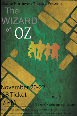
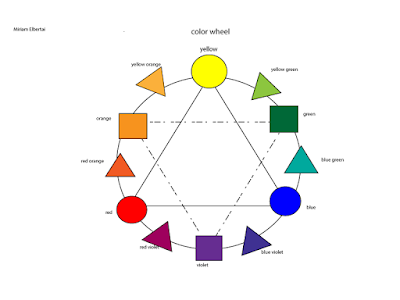
Wizard of oz poster

CARP poster For this poster, we where told to use the carp method. carp stands for contrast, alignment, repetition, and proximity. I used contras, which means use different fonts, colors, or sizes to make something you want the viewer to notice immediately when they look at the poster. One way I used contrast was the oz in the wizard of oz. I made it a different font, size, and color from the rest of the title. For contrast you don't have to do al three, but in this case, it made it look better. I used alignment, which means correctly spacing the credits, the title, and the information you need to know. I aligned all the typed words at the bottom so the poster could look more organized. I used repetition, which means repeating fonts, colors, sizes, pictures, etc. I repeated the gray font in the title of the school play, and I repeated the font and color for most of the credits and information for the play. I used proximity, which means parts of the project that are in...

