Posts

Senior final

      M y past four years with the eCommunications academy was overall an amazing and unique experience. freshman year I remember having a big interest in video and graphic design, but I wasn't so into animation and web. I made some great friends freshman year and that followed into my sophomore year. obviously, I chose video and graphic design. I had a lot of fun following tutorials and creating art I could be proud of in graphic design and I loved making music video remakes and doing mini cover stories. at the end of the sophomore year, I decided to go into convergence journalism. I didn't really connect with the people in that class and within a week I switched to entertainment video. I loved the people in my new class but a part of me always kind of wished I stayed in journalism because that has been something I've been into since middle school. however, I did find something I loved in entertainment and that was my role as a documentarian in that year's feature film...

Film real (December 2020)

     For my reel, I felt like it represented me as an editor and my style of editing pretty well. I started out by choosing the music that I thought would fit my overall vibe. Next, I found some of my old projects (a couple u could not find due to t last year's seniors taking projects off their YouTube channel after they graduated). After that, I put all the videos together to make a smooth, flowing reel that I thought fit me.      Over the past four years of eComm, I have acquired many shots throughout all of my projects. some good, others not so good. I made sure to incorporate some of the best shots that I have taken (specifically from the junior and senior year). many were from a music video I directed from last year and a commercial I also directed this year. unfortunately, I failed to get some of what I believed were some of the best shots from some of my projects last year as I sai...

RK kiss lipstick commercial

 For our commercial, we chose RK lipstick for our product. Our concept was to have two actors and two different colors of lip sticks and have it be 80s punk. For pre-production, we first decided what production roles would be best for this project. I was director, Jaden did art direction, Aly was DP, and Shaylee was the editor. After we established production roles, we made storyboards and a script.  Shaylee and I ended up being the two actors. We chose outfits that would go with the theme of the commercial. I wore purple lipstick so I just wore a big black t-shirt with a faded grey face on it. Shayley wore a ripped black shirt over a red shirt to match her red lipstick. After that, we chose a film date, since this was a 30 second commercial with only two different locations that were walking distance apart, this only took us one filming day. we went a little bit off-script but it worked. after we filmed, Shaylee used a fast beat song and some filters to give it more of an 80s...

music video review

violet-hippocampus          This music video start off with four different shots. each of them have their own color theme, and an item. Yellow was a football helmet, pink was a cardboard heart, green was a pinata, and blue was an ice cream Sunday. each of those four colored shots also repeat throughout the video with the members of the band, all four of them also having their own color, and wearing an outfit with that color. as the video progresses it switches between the band members playing o singing, and these four items getting beat up. this music video had o specific story line to it, it simply has just things getting destroyed mixed with Jake Lupen singing, and his band either playing the guitar or drum set. they did a great job in lighting and cinematographic shots. the editing was right on beat and was a pretty simple yet interesting video to watch. One element from this music video that i would like to do in my own is how thy edited it together, i...

semester 1 final

Projects this semester       We did three projects this semester. I came to this class late because I was previously in convergence journalism. I came to this class while we were doing the six shot system, this was video assignment one , and I just hopped into a group. we did ours over silly putty. I helped with lights and I acted. this project took around two weeks. some challenges we faced is that we used a blanket for the background and it wouldn't stay up, but eventually we got it.      We did a Levis commercia l. our idea was we based it off of a scene from Spiderman three. for this I was casting director and I acted in it. I feel like we did a really good job on it. our cinematographer and colorist did a really good job on making it look good. we were organized and got our project done on time.   My current project is the short film.  this project is longer because we all had to write treatments, and then tho chosen o...

semester 2 final blog

Image
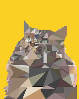
My favorite project this year was the advertising project. We chose a band or artist and we made a poster about them, tickets, and post cards. This project took me around a month to do. Some challenges I faced was not being good at using the curve tool, and the picture I used for the poster was blurry. A new skill I learned was I now can use the curve tool semi well, and I learned how to use  InDesign better. Some of the feedback I got was that the colors I used looked kind of childish so I changed them too look better. With my original idea it was super chaotic and I changed it to be less like that. I feel like overall it could have been better but it wasn't bad. Another one of my favorite projects was the vector project. we chose a picture of a family member, pet, or your self. I chose a picture of my cat. This project took me a while to do because I had to make a bunch of triangles and then color them in. Some challenges I faced was that I thought while coloring in that wher...

movie trailer

Before we started filming, we had to choose a movie, make a story bored, and more. we chose this one movie, but we didn't end up doing it. I made a story board for it and we got everything done for it. so before we started filming, everything was organized. next, the person filming got actors for the film so he could film over spring break. unfortunately i could not attend because i was out of town Unfortunately, he could not get any actors, but that did not stop us. he filmed random clips around the place where he works, amc, and we made our own movie trailer. we all edited our own video, so mine was a horror story. it just had scary music and eerie shots, so it worked well. when i edited it all together, as unorganized and unplanned this was, it came out okay. (this is what happens when we are not allowed to choose our groups). I did not watch my other groups videos yet, but the one thing good about this is that all three of ours will be unique. We where supposed to recreate ...

vector illustrated portrait

Image
Pre-Production At first, we where told to find a high definition photo of yourself, a family member, or a pet. The first thing that popped into my mind was my pet cat. she is fluffy and cute, so I thought that it would be good for this project. when I was little, I had an instagram account for my cat. my dad was teaching me art photography, so I would use his camera and practice taking pictures of her. I used one of my favorite photos. we took that photo and we put it into photoshop. we cropped it to be the correct size, and then we edited it to make it easier to find different colors in the future. I decided to do the triangles because I'm not really good with the pen curve tool, and I wanted this too look as good as possible. Production This was more difficult then I thought. the photo I chose was full of colors cause my cat has many different shades of brown, orange, grey, black, and white. I had...

music video project

Our project was to make a music video, but its not as simple as it seems. First thing we did was assign roles, like director, main editor, cinimatographer, ect. After assigning roles, we began getting ready for shooting, but this is a long process. i made a story bored of every shot from the music video, Congradulations, by Post Malone. this took a while cause i sketched every shot, lightly described the shot, and wrote down the lirics for each shot that had any. the people in my group also where doing thing for post production. once we where done with this we started getting ready to shoot. we had to get many actors for our music video to come in during 4th hour. We didnt get all of this done so we got some done during lunch too. unfortunatly, our main actor playing post maolone, had to go back to class during 4th hour, so we only god one shot by himself. for editing, that didnt make it easy. We filmed in the green screen room and the room next to it because it had a big table simil...

typography

Image
preproduction we chose 10 quotes that best represented us. honestly for me, I just chose quotes that I strongly believed in and that where sort and simple. out of those 10, we chose our four favorite ones to use. I chose 1) Wherever life plants you, bloom with grace 2) be a voice, not an echo 3) the trouble is, you think you have time 4) die with memories, not dreams. after choosing these quotes, we went to a website with some pretty unique fonts. I chose fonts that I thought fit with the specific words and quotes. we chose at least two fonts to use for each quote. production during the production I was able to praise using then pen tool, which is kinda difficult for me, and I think I have gotten much better at it from this project. for the project, we had to arrange the type to make it look pleasing. I made most of mine in the middle, besides on that was more on the right to left. personally, I like working in color more then I like working in black and white cause it makes more...

performance review

Image
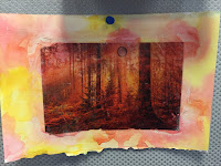
Projects this semester      my favorite project this semester was the one where we printed our edited image onto a water color that made. We got to make two different watercolors, for me I did one with warm colors and one with cool colors. Then following multiple steps, I printed the same photo that I edited onto the water color. it was really fun and it looked great. the other project that I really like is one the wr are working on right now. we got to choose our own infographic to work on and I chose to do now with elephants. I am not done with it, but I did finish the graphics and the freedom and creativity I was alowed in this project made it really fun for me. Productivity in class      I would not say that I am completely productive in class. when I am not working I am talking to Asya or I'm on my phone. I could have gotten more work done and been more productive during the semester. though even with this, I am able to get all of my work done,...

watercolor prints

Image
          For graphic design we made watercolor prints. we took a photo that we edited and we printed it off twice, one in color now in black and white. We got two pieces of white paper and we painted them with water color. I painted lone of them with warm colors and the other with cool colors. we the put a white paste on the picture we printed off and we placed it on the watercolor. Then after it dried we put water on our fingers and rubbed off the original paper we printed off and by the time we rubbed it all off there would be a print from our edited photo.            Throughout this project I came up with multiple struggles. One of the was I forgot we had to rub off the paper and not peel so I peeled a corner off and the print came off too. Another one was I used t much water so the watercolor got messed up and the print faded.

pressure and ink

Relief process In this process you use somthing called a baron to transfer the picture. u place the paper over the carved wood that has ink on it and you use the Barron to rub in the ink. the Barron is a wooden circle that makes the ink more visible for a better transfer. to make the print u use wood that is carved by hand and u use negative and positive space to show where and where not there will be ink to form the picture. intaglio process For this process you use copper and scratch it with the tool to make a picture. but first you have to buff and shine the copper so the un intended scratches won't effect the print. then you put it in a liquid to make it stronger and its a really important step. u make the copper jet black and u slightly scratch just so you can see the copper. lithography process this processs uses stone and it uses the technique of grease and water. they will draw with a greasy material onto a lithographic stone and then they use chemicals to treat the ...

Personal Narrative/Multi-Exposure Panorama

Image
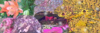
    Many people like flowers. I think I like flowers more then all of them. its almost an obsession. There isn't a flower that I do not like, from flowers people say are weeds to roses to sun flower. I have my very own flower garden so whenever I go outside to relax it smells beautiful. When winter comes, so does my sadness because there are no flowers. my garden has died but I still have my hope of spring. counting the days until my flowers bloom, and the bees and butterflies come.     It was a cold December night. I walked into my room and went under all of the covers and fell asleep. when I awoke there was this sweet summer smell that tickled my nose. the sun shined on my cold skin and warmed me up. I got up and looked around and all I could see where flowers. so many types of flowers. I sat back down just to admire the beauty. it was like a huge version of my garden.    I heared a sudden noise that I had heard before. I sat up quickly, and I realize...

pop art

         For this project we got a partner and we went outside and took pictures of them. we chose one of those photos to use for the pop art. After I chose a photo, I created a layer of just his face, and made the back ground green. this made his shoulders and the rest of the picture not visible, but only his face. next I used the paint brush and put a sort of splash design coming out of his face, going from light green to dark green. this gave it like a portle effect. After that i created another layer and made copies of his face and made it black and white and I scattered the throuout the picture.         This project help me understand how to use layers. layers are very important for photoshop. I also learned how to make a background a solid color, and that also used layers. I learned that I could use a bunch of different designs using paint brush. it makes the picture pop and I made the colors similar s it was more pleasing to the eye....

challenge photo shop edit

Our assignment Our class has been given multiple different assignments teaching us how to use photoshop. After we got done with those, our teacher gave us a challenge. She put a photo of a man with a white background n the server, and a video explaining what this one guy did giving us some ideas. She also put a coupe photos of nature. the assignment was to put the photo and make it into the design of his shirt. You could also do the background, his hair, ect. Process First I put the photo of the man onto photoshop. Then using different layers I put an image of a cliff onto his shirt, but it looked like dirt and roots. The name of this project is nature man according to my teacher. I made it only on the shirt tho, not the sleeves cause why not. What I learned I learned how to put a picture onto a specific part of a photo. This was a pretty cool learning experience to cause I messed around with photoshop so I found out that there is two different ways to put the picture onto his s...

First project of the year (graphic design)

     For the first project we where given a set of tutorials and pictures that went with the tutorials. Step by step, we watched the tutorials and we edited the photo for the specific video. There was a set of 6 but in total we edited 8 photos.      We learned how to take unwanted objects out of photos. we used healing brushes, layers, ect using adobe photoshop. with each photo there was different set of unique difficulties to the unwanted objects. For the six different tutorials there was learning how to use content aware fill, patch tool, clone stamp and healing brush, clone stamp and patch tool, spot healing brush, and building a portrait collage. The sixth video was the most difficult cause it came with its own set of 6 tutorials. The first one was simple, you just had to arrange the layers. the second one you extended the background, third was too retouch the main image. Fourth was to mask the main image, five was to refine the mask and finally six...

Ecomm Final Project

Image
                   This semester for our final, we did a project that used video, graphic design, web design, and animation.  We created a company and then a product by the company. Our company name was Pack Backs and we sold the infinity pack. The infinity pack is an infinite storage in a regular back pack. You could think of something you want, reach ur hand in, and pull out the object of your desire. some challenges we faced where thinking of ways to avoid inflation and making the perfect logo. We learned how to make our one website and work as a team. After nine weeks of hard work I Personally think our project was a major success and many people would buy our product.           During class time we accomplished a lot of work. As a team we finished the video, created the perfect logo, made a website with the design matching the theme of our company, and we made multiple animations. To stay productiv...

CSS and CARP design

CSS and CARP design            This week in Ecomm, we made a website. We had to learn and use things that are mandatory for creating a website such as CSS and HTML. To correctly design the website, a while back we learned something called carp. Carp stands for contrast, alignment, repetition, and proximity. We where given a list to do to make this website more pleasing to look at by using this specific strategy. Contrast            Contrast draws your attention to the page. Usually contrast is between opposite colors, like black and white, or red and green. We used contrast for this website by using different shades of brown from the dog. We also used different text, like the size between the title and the paragraphs made you look strait to the title. Alighnment           Alignment is where you correctly align text, paragraphs, or pictures to make it pleasing to the eye. We used alignment i this...

SketchUp House

Image
         This week in ecomm we where told to make a house. Our teacher put up pictures of houses on google classroom so we could look at. After we made the house, including the deck, roof, windows, doors, we had to make textures and colors for the house. We where told that we had to use at least two textures that where not from SketchUp. That meant we had to get it from the internet. We would drag the texture that we liked to the home page, and then into SketchUp. After that, we animated it. We made different frames for the house by using different angles.            For my house, i made more of a simplistic design. My house was small, and was brick. I also used a dark, old looking wood that i got from the internet. for the stairs, i used rock rather than wood, because i personally thought it looked better. for the door i made it have a window. The animation, we got to choose our different frames. i used six different frames ...