Posts

ball animation

Image
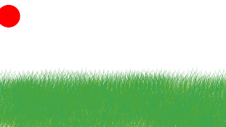
This week in Ecomm we had a project. Our teacher told us to go on photoshop and make an animation that had to do with the ball bouncing from the corner like he taught us to do. When the ball was done bouncing, there had to be a surprise at the end. For my animation, I made grass with the brush for my background, and frame by frame I made the ball bounce. When the ball stopped bouncing, I wanted my surprise to be different. originally I wanted the ball to be like an egg, and a chicken pop out of it. I had some difficulties with that so I made a raven (our mascot) jump out instead. I thought the raven looked boring so I put a crown and a cape on him making him a king raven jumping out of a red bouncy ball. Not only that but I made a cage fall on him. The process of making this animation, that is about five seconds, took 3 days. The background was pretty easy, I just took a brush that looked like grass, and filled in a little more than a third of the page. next, I made the ball ...

website project

Image
This project took a lot of work but overall it was pretty simple. Our teacher made a series of videos that we could watch and follow along with. We had to take a picture of ourselfs and put it on our website. We made links to the e Comm website, the school website, and our own website. The video taught us about basic website making so we could create one ourself. We also wrote somthing called an elevator pitch. A elevtor pitch is somthing that you would say to a future boss in a quick amount of time on the elevator I learned many things with the project. We learned how to make the basic foundation of a website, how to quickly say what ur talents are, how to make links on our website to other websites, ect. This project taught us many things that i never even thought of when I looked at some random website. Next time we do this I will know how to work dream weaver a little better, because the hardest part of this project was acually settng up dream weaver. Also, it will be a lot mo...

elevator pitch

My name is Miriam Elbertai and I am a student at Olathe Northwest. One of my talents is photography. I take photos of many things. another one of my talents is sketching. I can draw with detail and shades with about almost anything. I have social skills such as conversation and respect. I am good with talking to people who are under stress and i am good at calming people down. I am also good with aimals and taking care of them.

name logo

Image
          The process of creating a logo first starts in the mind. we where told to think of logos and sketch them down on paper. When I thought of a logo, I would sketch it down on paper and it would sometimes come out differently because I would change my mind while sketching it down. After I filled my notebook paper with different sketches, I went on the computer to adobe illustrate to put down my ideas. One of my ideas was to write my name, and put a pool f water around it representing that I am naturally messy. It did not look as good as when I sketched it down, so I decided to make  more simple logo.            Our teacher taught us how different shapes can represent different things, circle is natural, square is industrial, triangle is sharp and unfriendly, ect. I chose the circle and I put my initials in cursive making chains in a controlled place (the circle). The I had to choose the color, nd I liked t...

Wizard of oz poster

Image
CARP poster For this poster, we where told to use the carp method. carp stands for contrast, alignment, repetition, and proximity. I used contras, which means use different fonts, colors, or sizes to make something you want the viewer to notice immediately when they look at the poster. One way I used contrast was the oz in the wizard of oz. I made it a different font, size, and color from the rest of the title. For contrast you don't have to do al three, but in this case, it made it look better. I used alignment, which means correctly spacing the credits, the title, and the information you need to know. I aligned all the typed words at the bottom so the poster could look more organized. I used repetition, which means repeating fonts, colors, sizes, pictures, etc. I repeated the gray font in the title of the school play, and I repeated the font and color for most of the credits and information for the play. I used proximity, which means parts of the project that are in...

the anatomy of typography

Image
                  This week in ecomm we did a project on typography. First we typed out our names in any font we chose. Then we made lines to represent the letters hight, the lower case one was dashed.  for the specific font we used, we labeled the parts of the typography, and used lines to point out where in the letters they where.                 For this project, I learned how to use basic instructions for adobe illustrator. We learned how to type, make simple lines, line everything up, do dashes lines, different fonts, and how those different fonts effected what the human mind thought. We learned that there is a difference between professional, unprofessional, and over used fonts. We learned the basics of fonts and how they effected the lable.              This project went pretty well. We learned many things about the basics of graphic design. We  ...

Color Wheel

Image
Color Wheel