Posts

pressure and ink

Relief process In this process you use somthing called a baron to transfer the picture. u place the paper over the carved wood that has ink on it and you use the Barron to rub in the ink. the Barron is a wooden circle that makes the ink more visible for a better transfer. to make the print u use wood that is carved by hand and u use negative and positive space to show where and where not there will be ink to form the picture. intaglio process For this process you use copper and scratch it with the tool to make a picture. but first you have to buff and shine the copper so the un intended scratches won't effect the print. then you put it in a liquid to make it stronger and its a really important step. u make the copper jet black and u slightly scratch just so you can see the copper. lithography process this processs uses stone and it uses the technique of grease and water. they will draw with a greasy material onto a lithographic stone and then they use chemicals to treat the ...
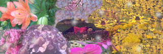
Personal Narrative/Multi-Exposure Panorama

Image
    Many people like flowers. I think I like flowers more then all of them. its almost an obsession. There isn't a flower that I do not like, from flowers people say are weeds to roses to sun flower. I have my very own flower garden so whenever I go outside to relax it smells beautiful. When winter comes, so does my sadness because there are no flowers. my garden has died but I still have my hope of spring. counting the days until my flowers bloom, and the bees and butterflies come.     It was a cold December night. I walked into my room and went under all of the covers and fell asleep. when I awoke there was this sweet summer smell that tickled my nose. the sun shined on my cold skin and warmed me up. I got up and looked around and all I could see where flowers. so many types of flowers. I sat back down just to admire the beauty. it was like a huge version of my garden.    I heared a sudden noise that I had heard before. I sat up quickly, and I realize...

pop art

         For this project we got a partner and we went outside and took pictures of them. we chose one of those photos to use for the pop art. After I chose a photo, I created a layer of just his face, and made the back ground green. this made his shoulders and the rest of the picture not visible, but only his face. next I used the paint brush and put a sort of splash design coming out of his face, going from light green to dark green. this gave it like a portle effect. After that i created another layer and made copies of his face and made it black and white and I scattered the throuout the picture.         This project help me understand how to use layers. layers are very important for photoshop. I also learned how to make a background a solid color, and that also used layers. I learned that I could use a bunch of different designs using paint brush. it makes the picture pop and I made the colors similar s it was more pleasing to the eye....

challenge photo shop edit

Our assignment Our class has been given multiple different assignments teaching us how to use photoshop. After we got done with those, our teacher gave us a challenge. She put a photo of a man with a white background n the server, and a video explaining what this one guy did giving us some ideas. She also put a coupe photos of nature. the assignment was to put the photo and make it into the design of his shirt. You could also do the background, his hair, ect. Process First I put the photo of the man onto photoshop. Then using different layers I put an image of a cliff onto his shirt, but it looked like dirt and roots. The name of this project is nature man according to my teacher. I made it only on the shirt tho, not the sleeves cause why not. What I learned I learned how to put a picture onto a specific part of a photo. This was a pretty cool learning experience to cause I messed around with photoshop so I found out that there is two different ways to put the picture onto his s...

First project of the year (graphic design)

     For the first project we where given a set of tutorials and pictures that went with the tutorials. Step by step, we watched the tutorials and we edited the photo for the specific video. There was a set of 6 but in total we edited 8 photos.      We learned how to take unwanted objects out of photos. we used healing brushes, layers, ect using adobe photoshop. with each photo there was different set of unique difficulties to the unwanted objects. For the six different tutorials there was learning how to use content aware fill, patch tool, clone stamp and healing brush, clone stamp and patch tool, spot healing brush, and building a portrait collage. The sixth video was the most difficult cause it came with its own set of 6 tutorials. The first one was simple, you just had to arrange the layers. the second one you extended the background, third was too retouch the main image. Fourth was to mask the main image, five was to refine the mask and finally six...

Ecomm Final Project

Image
                   This semester for our final, we did a project that used video, graphic design, web design, and animation.  We created a company and then a product by the company. Our company name was Pack Backs and we sold the infinity pack. The infinity pack is an infinite storage in a regular back pack. You could think of something you want, reach ur hand in, and pull out the object of your desire. some challenges we faced where thinking of ways to avoid inflation and making the perfect logo. We learned how to make our one website and work as a team. After nine weeks of hard work I Personally think our project was a major success and many people would buy our product.           During class time we accomplished a lot of work. As a team we finished the video, created the perfect logo, made a website with the design matching the theme of our company, and we made multiple animations. To stay productiv...

CSS and CARP design

CSS and CARP design            This week in Ecomm, we made a website. We had to learn and use things that are mandatory for creating a website such as CSS and HTML. To correctly design the website, a while back we learned something called carp. Carp stands for contrast, alignment, repetition, and proximity. We where given a list to do to make this website more pleasing to look at by using this specific strategy. Contrast            Contrast draws your attention to the page. Usually contrast is between opposite colors, like black and white, or red and green. We used contrast for this website by using different shades of brown from the dog. We also used different text, like the size between the title and the paragraphs made you look strait to the title. Alighnment           Alignment is where you correctly align text, paragraphs, or pictures to make it pleasing to the eye. We used alignment i this...