typography
preproduction
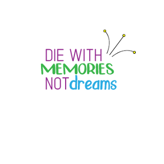
we chose 10 quotes that best represented us. honestly for me, I just chose quotes that I strongly believed in and that where sort and simple. out of those 10, we chose our four favorite ones to use. I chose 1) Wherever life plants you, bloom with grace 2) be a voice, not an echo 3) the trouble is, you think you have time 4) die with memories, not dreams. after choosing these quotes, we went to a website with some pretty unique fonts. I chose fonts that I thought fit with the specific words and quotes. we chose at least two fonts to use for each quote.
production
during the production I was able to praise using then pen tool, which is kinda difficult for me, and I think I have gotten much better at it from this project. for the project, we had to arrange the type to make it look pleasing. I made most of mine in the middle, besides on that was more on the right to left. personally, I like working in color more then I like working in black and white cause it makes more possiblilities for the graphics and you can choose to make certain things pop to bring out parts of what you want.
postproduction
I feel like my finish predict was pretty good. I thought I used the colors well and that the Fonts matched my quotes. I also thought my graphics looked professional. I don't think they are the best they could be because if I had more time, I would make the flower that I made have much more detail. I don't mind how that graphic came out tho because I think the simple look matched the quote. here are some of them I made:


Comments
Post a Comment